
Focus Rings Are a Product Decision: Designing Keyboard Focus That Ships
Most focus rings are either invisible or ugly enough that a designer strips them out. Here's how to design keyboard focus that survives brand review, passes WCAG, and doesn't break your dark mode.
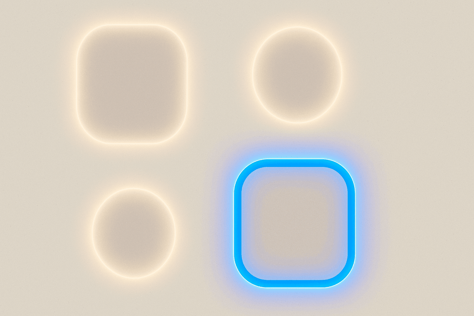
Every design system I've audited in the last two years has the same bug: the focus ring is either missing, hidden behind outline: none, or so anemic it fails contrast on half the components it wraps. Then someone files a Lighthouse ticket, an engineer slaps ring-2 ring-blue-500 on everything, and the design lead quietly hates it.
Focus styling is not a CSS afterthought. It's a product decision with brand, accessibility, and engineering consequences. Here's how we approach it on client work.
Why focus rings keep getting deleted
The honest answer: default browser focus rings look bad next to a considered visual system. Chrome's blue halo clashes with a warm palette. Safari's subtle ring disappears on light gray. Firefox's dotted outline looks like it's from 2004.
So a designer opens the CSS and writes:
*:focus { outline: none; }
And now nobody using a keyboard, a switch device, or a screen reader with visual tracking can tell where they are on the page. WCAG 2.4.7 (Focus Visible) fails. WCAG 2.4.11 (Focus Not Obscured), added in 2.2, fails harder because sticky headers now cover the focused element with no indication.
The fix isn't "put the outline back." The fix is to design a focus system that the design team actually wants to ship.
The three failure modes
Before we design anything, name the enemy. Focus rings fail in three ways:
- Invisible — removed entirely, or contrast below 3:1 against the adjacent color.
- Ambiguous — visible, but you can't tell which element has focus (usually because hover and focus styles are identical, or the ring is inside the element and clipped).
- Ugly — visible and accessible, but so off-brand it gets stripped in the next redesign.
A good focus system solves all three at once.
The contrast math nobody checks
WCAG 1.4.11 (Non-text Contrast) requires focus indicators to hit 3:1 against the adjacent color — not against the page background, against whatever's directly next to the ring.
That "adjacent" word is where most systems break. A blue focus ring on a white card looks fine. Put the same card on a blue hero section and the ring vanishes on two sides.
WCAG 2.4.13 (Focus Appearance), which is AAA in 2.2 but a good target, adds more: the indicator needs to be at least 2px thick and enclose the component, with 3:1 contrast against both focused and unfocused states.
In practice, that means:
- A single-color ring will fail somewhere in your app. Guaranteed.
- You need a two-tone ring: an inner and outer color that guarantee contrast on any background.
- Or you need a ring that includes an offset (a gap) filled with the page background, which visually separates the ring from adjacent surfaces.
The offset trick is what Tailwind's ring-offset gives you, and it's the cheapest structural win in the toolkit.
A focus token model that works
Here's the token structure we've landed on for design systems that need to survive brand refreshes and dark mode:
{
  "focus": {
    "ring": {
      "color": { "value": "{color.brand.500}" },
      "width": { "value": "2px" },
      "offset": { "value": "2px" },
      "offsetColor": { "value": "{color.surface.base}" },
      "radius": { "value": "{radius.md}" }
    },
    "ringInverse": {
      "color": { "value": "{color.neutral.0}" },
      "offsetColor": { "value": "{color.brand.700}" }
    }
  }
}
Two tokens, not one. focus.ring is your default. focus.ringInverse is what you apply when a component sits on a saturated brand surface. Every button, input, link, and card gets one of the two, and the choice is a component-level decision, not an engineering guess.
Mapping to Tailwind
If you're on Tailwind 3 or 4, this maps cleanly:
// tailwind.config.js
module.exports = {
  theme: {
    extend: {
      ringColor: {
        focus: 'var(--focus-ring-color)',
        'focus-inverse': 'var(--focus-ring-inverse-color)'
      },
      ringOffsetColor: {
        focus: 'var(--focus-ring-offset-color)'
      }
    }
  }
}
And the component class becomes:
<button class="... focus-visible:outline-none
               focus-visible:ring-2
               focus-visible:ring-focus
               focus-visible:ring-offset-2
               focus-visible:ring-offset-focus">
  Save changes
</button>
Note focus-visible, not focus. This is the pattern that solves 90% of the "designers hate the ring" objection: mouse clicks don't trigger it, keyboard navigation does. Chrome, Safari, and Firefox have all supported it for years now.
Focus-visible is the peace treaty
Before :focus-visible, we had two bad options: show the ring on every click (ugly), or hide it entirely (inaccessible). :focus-visible is the browser's heuristic for "was this focus triggered by a keyboard or assistive tech?" If yes, style it. If no, don't.
The rule we ship:
:focus { outline: none; }
:focus-visible {
  outline: var(--focus-ring-width) solid var(--focus-ring-color);
  outline-offset: var(--focus-ring-offset);
  border-radius: var(--focus-ring-radius);
}
Using outline instead of box-shadow matters: outline-offset respects border-radius in every modern browser now, and outlines don't get clipped by overflow: hidden parents the way box-shadows do. If you've ever debugged a focus ring that disappears inside a modal or a card with clipped corners, that's the fix.
The one exception: custom composite widgets
For things like segmented controls, combobox options, or grid cells, the focused child often sits inside a rounded parent with overflow: hidden. Outlines still get clipped by ancestor scroll containers in some edge cases. There, use an inset box-shadow ring:
.option:focus-visible {
  box-shadow: inset 0 0 0 2px var(--focus-ring-color);
}
Document this exception in your system. Otherwise engineers will use box-shadow everywhere and you'll lose the outline-offset benefit.
Dark mode, brand surfaces, and the inverse ring
Here's the war story. On a recent e-commerce project, the checkout had a dark navy CTA section. The primary button used the brand blue focus ring — same blue as the button background. Keyboard users literally could not see focus on the most important button in the funnel.
QA missed it because they clicked through. The accessibility audit caught it the week before launch.
The fix was the inverse token. Any component that sits on a surface within ~40% of the ring color's hue automatically gets focus.ringInverse — a white ring with a dark offset. We enforce this with a lint rule on the component library: if a button variant declares surface: brand, the focus token must be ringInverse.
This is the kind of rule that only works if focus is a first-class token, not a utility class copied around.
Focus Not Obscured: the 2.2 trap
WCAG 2.2's success criterion 2.4.11 says the focused element can't be entirely hidden by author-created content. Sticky headers, cookie banners, and chat widgets are the usual culprits.
Two practical mitigations:
- Set
scroll-padding-topon yourhtmlelement equal to your sticky header height. Browsers use this when scrolling focused elements into view. - Audit any
position: fixedelement that can cover the viewport. If it can, it needs either a dismiss affordance or logic to not block focused elements.
html {
  scroll-padding-top: 4rem; /* matches sticky header */
  scroll-padding-bottom: 6rem; /* matches cookie banner if present */
}
This is a one-line accessibility win that most sites are missing in 2026.
Testing without a screen reader
You don't need NVDA installed to catch 80% of focus bugs. Three checks:
- Tab through every page. Can you always see where you are? Does focus ever land on something invisible or off-screen?
- Use a browser extension or DevTools to force
:focus-visibleon every interactive element and screenshot it against light, dark, and brand surfaces. - Run axe or Lighthouse, but treat them as a floor, not a ceiling. They catch missing focus, not ambiguous focus.
For teams shipping design systems, we've had good results building a Storybook addon that renders every component in its focused state across three background colors. It turns "does focus work here?" from a manual audit into a visual regression test.
Where we'd start
If you're staring at a system with outline: none scattered through it, don't try to fix everything at once. Do this in order:
- Delete every
outline: nonethat isn't paired with a:focus-visiblereplacement. One search, one PR. - Add two focus tokens — default and inverse — and wire them to CSS variables.
- Update your button, input, link, and card primitives to use
:focus-visiblewith those tokens. That's usually 80% of interactive surface area. - Add
scroll-padding-topfor your sticky header. Ten seconds, real win. - Then start on composite widgets, menus, and custom controls.
Focus rings won't win you a design award. But shipping a system where every keyboard user can see where they are, on every surface, without the design team stripping it out in the next quarterly refresh — that's the bar. If you want a hand pulling this apart in your own product, our design and UX work usually starts exactly here.
Want a team like ours?
72Technologies builds production software for the kind of teams who actually read this blog.
Start a projectKeep reading

Design Tokens That Survive Contact With Engineering: A Naming Convention That Scales
Most design token systems die at the second theme. Here's a three-tier naming convention that survives dark mode, brand refreshes, and the inevitable Tailwind migration.

Empty States Are Your Second Homepage: Designing Them Like Product Surface
Empty states get treated like an afterthought — a shrug icon and a sentence. They're actually one of the highest-leverage screens in your product. Here's how to design and ship them like it.
Skeleton Screens Are Lying to Your Users: A Better Loading Strategy
Skeleton screens became the default for perceived performance, but most implementations make apps feel slower and less trustworthy. Here's when to use them, when to skip them, and what to build instead.